Read the blog here! Click here for more information! Contact us!
You’ve probably seen this pass by many times on various websites. These “cries” are also called “calls to actions,” or in other words, a call to action. In this blog, I will tell you the importance of a call to action, its position, the text and the psychology behind the use of colors.
What is a Call to Action?
A Call to Action (CTA) is a super important tool in online marketing. It is that one element that urges visitors to do something, such as contact you, request a quote, or sign up for a newsletter. Often this is an eye-catching button with short, powerful text such as “Order Now,” “Sign Up,” or “Download. But CTAs can also be plain text, for example at the end of a blog post. Then you often refer to ‘contact us’ or ‘read more?’
The importance of CTAs in online marketing
A CTA is much more than a simple button; it is a crucial part of your online strategy. By placing CTAs smartly, you can convert visitors into leads or customers. Make sure your CTA is always clear, visible and appropriate to the stage the visitor is in. Someone who has just landed on your product page will not buy right away, but probably wants more info.
The CTA is therefore also a signpost. It helps the visitor discover the possibilities of your website and find relevant information. But in addition, the call to action shows search engines the way. Search engines recognize the button as a click-through within your website. The more page views within your website, the more relevant search engines like Google find your website. This boosts your SEO ranking position in the Google SERP.
What text do you put in the CTA?
It’s important to think carefully about what kind of text you use in the CTA. Here are a few tips:
Attract attention
- Motion: Make the button move a little to stand out.
- Contrasting color: Choose a color that contrasts with the rest of the page.
Keep it organized
- Limit the number of CTAs per page to avoid confusion.
- Provide a recognizable button shape and use white space to make the CTA stand out.
Keep the text simple
- Use short, clear text that begins with a verb, such as “Download,” “Buy,” or “Subscribe.
Make it worthwhile
- Highlight the benefits of clicks, such as “Get a quote right away” instead of “Leave your email address.
At what position do you put the CTA?
Where you place the banner or button also definitely has an impact. You want the CTA to be immediately visible to the visitor. In his book Building a StoryBrand, Donald Miller – a New York Times bestselling author – explains that when people visit your Web site, the first thing they see is the images and text above the fold. The term “above the fold” comes from the newspaper industry and refers to the stories printed above where the newspaper is folded in half. On a Web site, the images and text above the fold refer to what you see and read before you start scrolling.
There are two main places we want to put a direct Call to Action. The first is at the top right of your website and the second is in the middle of the screen, above the fold. Your customer’s eye moves quickly across your website in a Z pattern.
Imagine you are reading a book or a newspaper. Your eyes move across the page in a certain way, right? That’s exactly what the Gutenberg diagram is about. It shows how our eyes move across text that is neatly divided, like in a book or a newspaper. Your eyes start at the top left, then move to the top right, descend to the bottom left and end at the bottom right. This is also called “reading gravity,” because your eyes are pulled downward, so to speak.
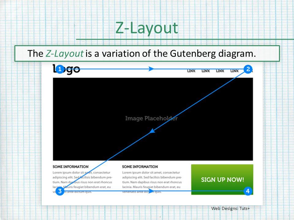
Source: slideplayer.com
So, when you design a website or document, you want the most important information to be on that route: your logo or a header at the top left, important text in the middle, and your call-to-action or contact information at the very bottom right. It’s like pointing the way to your readers without them realizing it.
What color do you choose for the CTA?
Behind every color is a fascinating psychology that marketers cleverly exploit. After all, colors influence how people respond. Research, such as The Value of Color Research in Brand Strategy by Meagan K. Cunningham, shows that colors can quickly form an opinion about a product or service, often within seconds.
As early as the 1970s, researchers discovered a link between color, emotion and perception. Colors such as red evoke excitement, yellow is seen as cheerful, green conveys a sense of security, and blue is often associated with confidence and calm. These kinds of insights are golden for marketers because the color of a brand can directly impact how a consumer feels when seeing it.
So, thinking about the color of your CTA button, for example, that choice definitely affects how visitors respond. According to Cunningham and other experts, it’s smart to make sure your CTA stands out, preferably with a contrasting color to the rest of your website. Avoid black, white or gray buttons, as they often lack the contrast needed to really stand out. Also make sure there is enough contrast between the text and the color of the button so that your CTA remains easily readable. Contrast also ensures that people who are color-blind can still easily distinguish the button from the background color.
This is all about grabbing attention, because let’s face it: people scan websites more than they read. You want that eye-catching CTA button to come back again and again, so visitors immediately know what to do without thinking too much about it.
[Read the conclusion here]
An effective Call to Action is essential to your website’s conversion rate. Research shows that the text, position and color of a CTA all contribute to a higher click-through rate and better conversion results. Experiment with different elements to discover what works best for your target audience and website. By making smart use of CTAs, you can improve the visitor’s experience while increasing your conversions.
What is a call to action?
Why is a CTA important for my website?
What do I put in the text of a CTA?
Where do I place the CTA on my website?
What color works best for a CTA button?
How many CTAs do I put on a page?
Limit the number of CTAs per page to avoid confusion. Provide a recognizable button shape and enough white space to make the CTA stand out.